Ayatana Packaging
MY ROLE/
ART DIRECTION
PACKAGING DESIGN
CLIENT/
AYATANA
YEAR/
2018
GOAL/
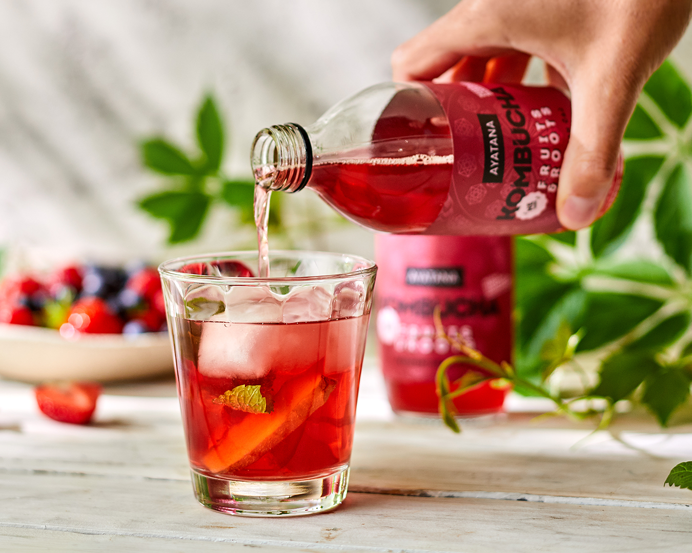
The main goal of the project was to design the packaging with the East in mind, in order to tell the story of kombucha’s original roots.
SOLUTION/
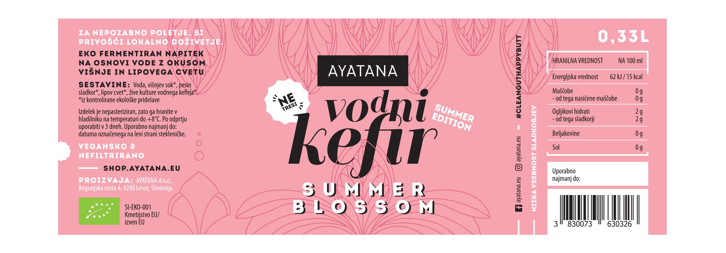
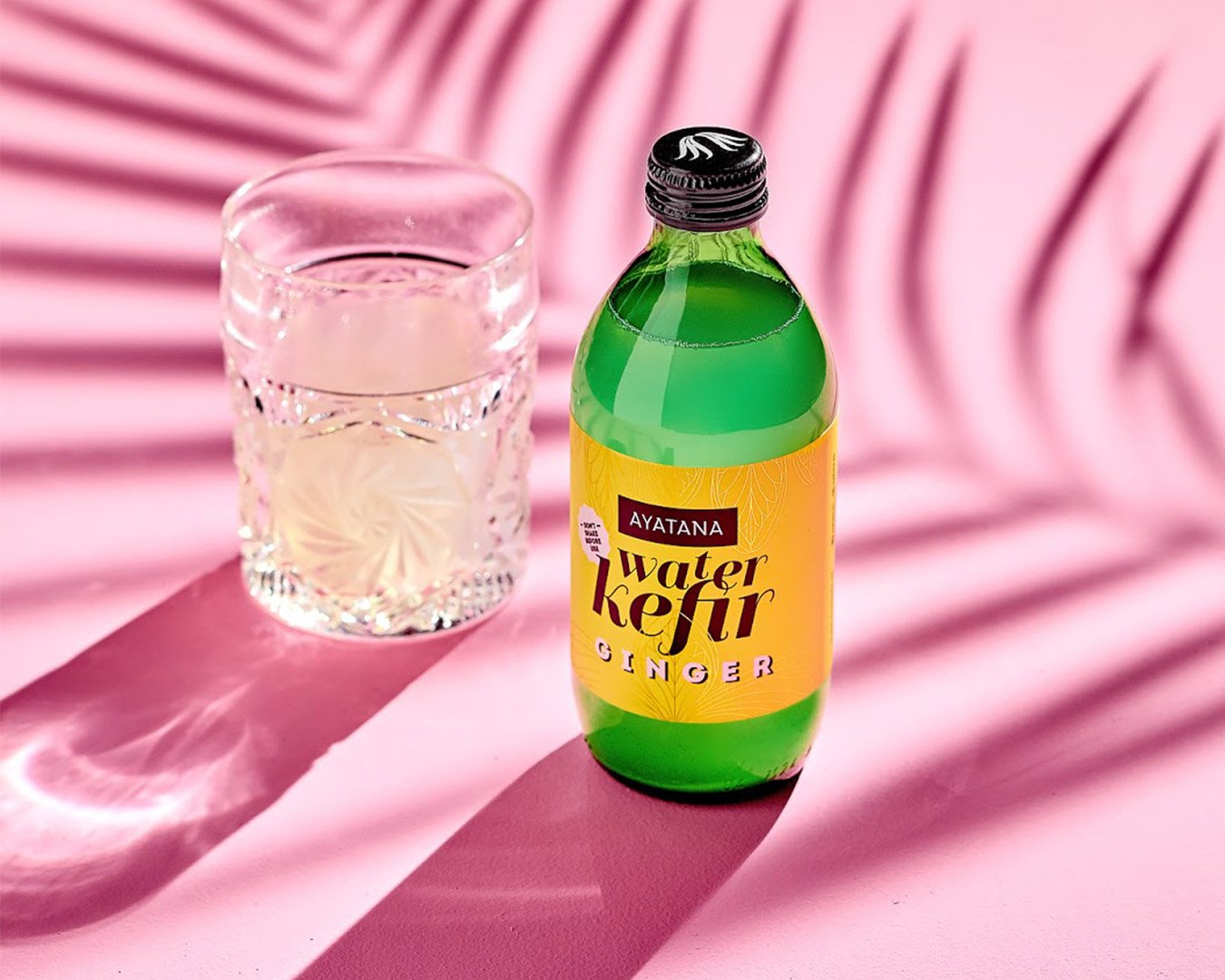
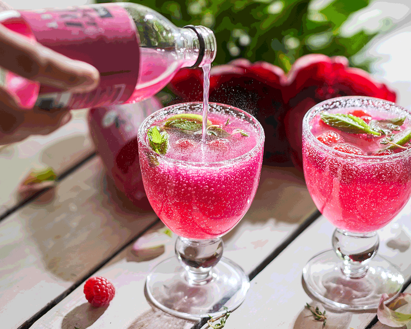
Kombucha is Ayatana’s main product within the assortment, so the initial focus was entirely on it. The label design for the water kefirs followed only after the kombuchas were already established.
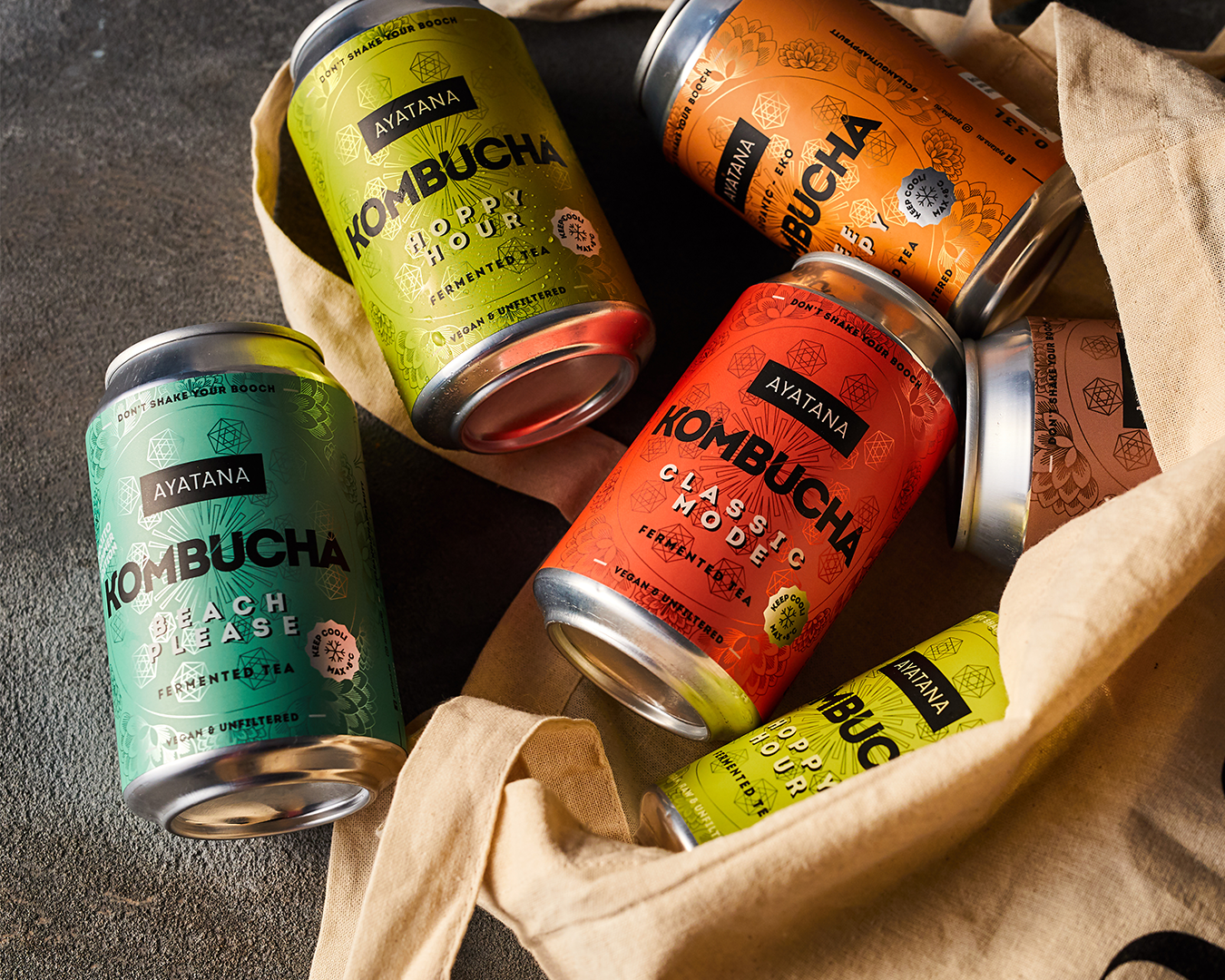
In the design process, I wanted to make the most not only of the right graphic elements but also of the printing technique itself, which was digital—ideal for the small batch the client needed for their first production run. I chose an aluminum base, which allowed me to integrate color-adjusted metallic effects into the overall visual identity of the bottles.
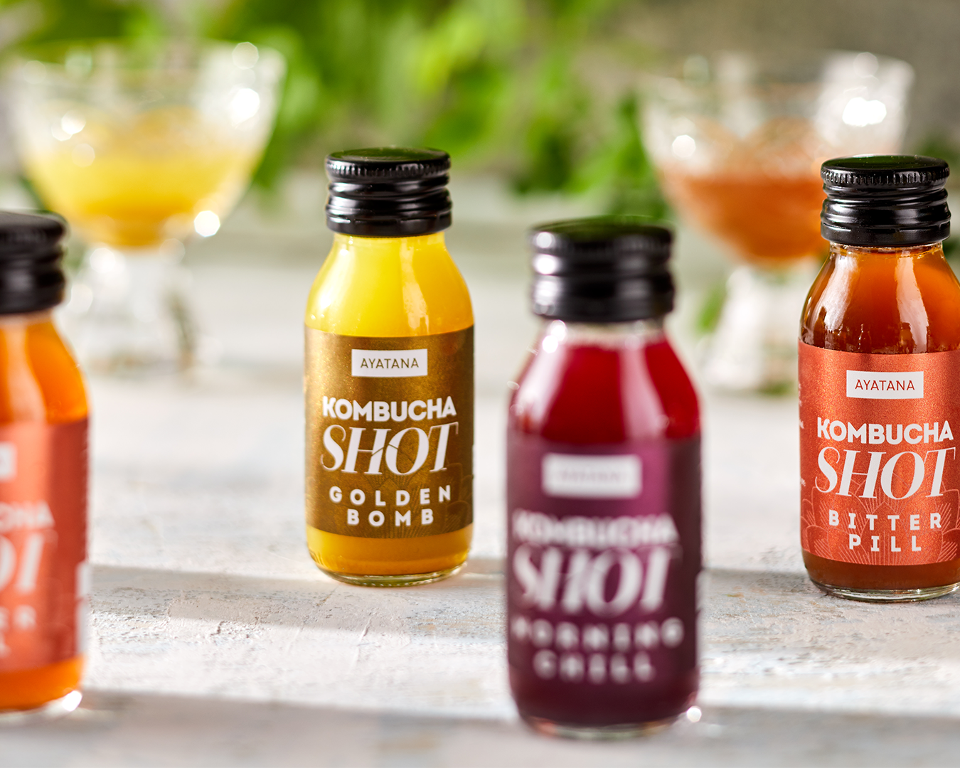
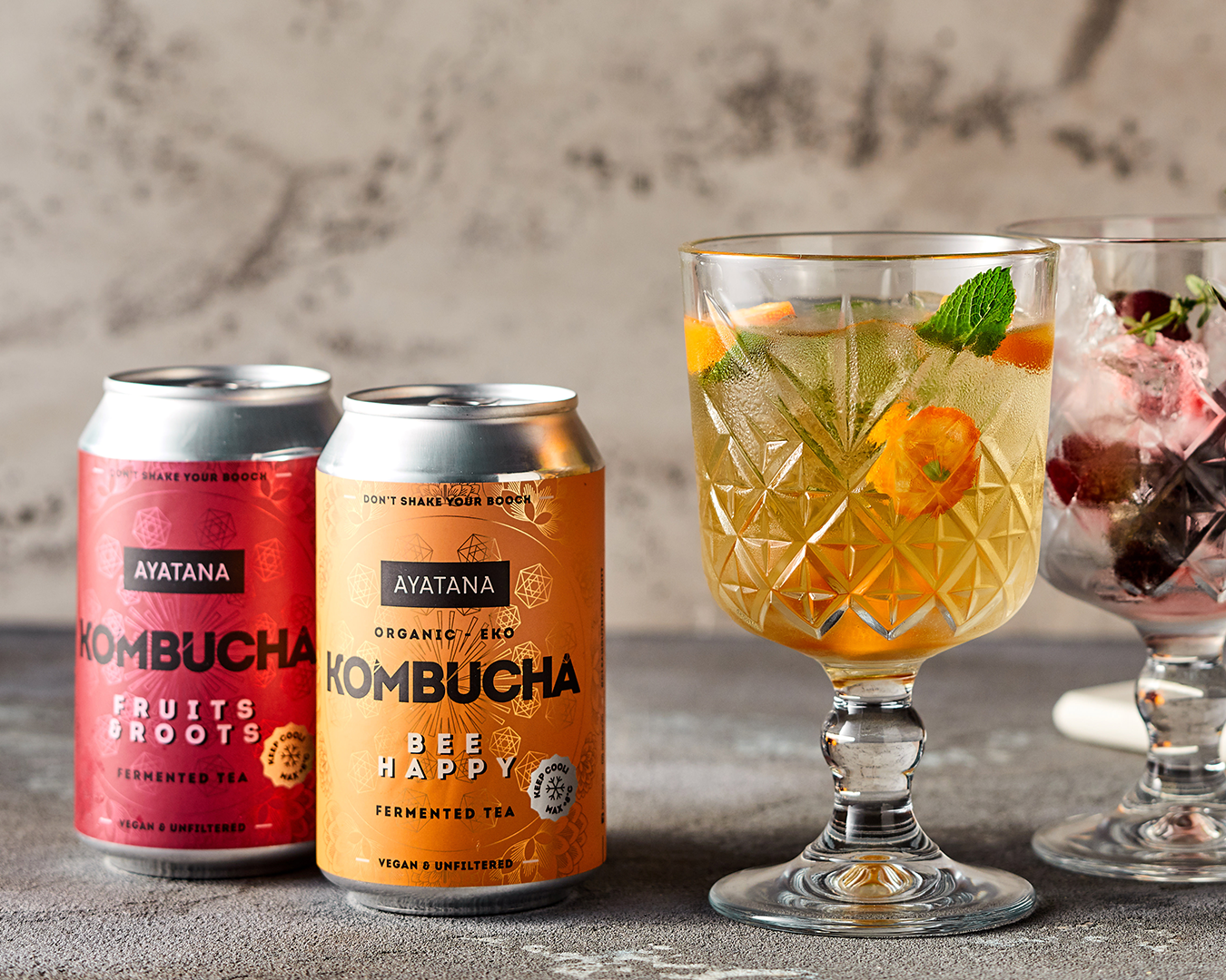
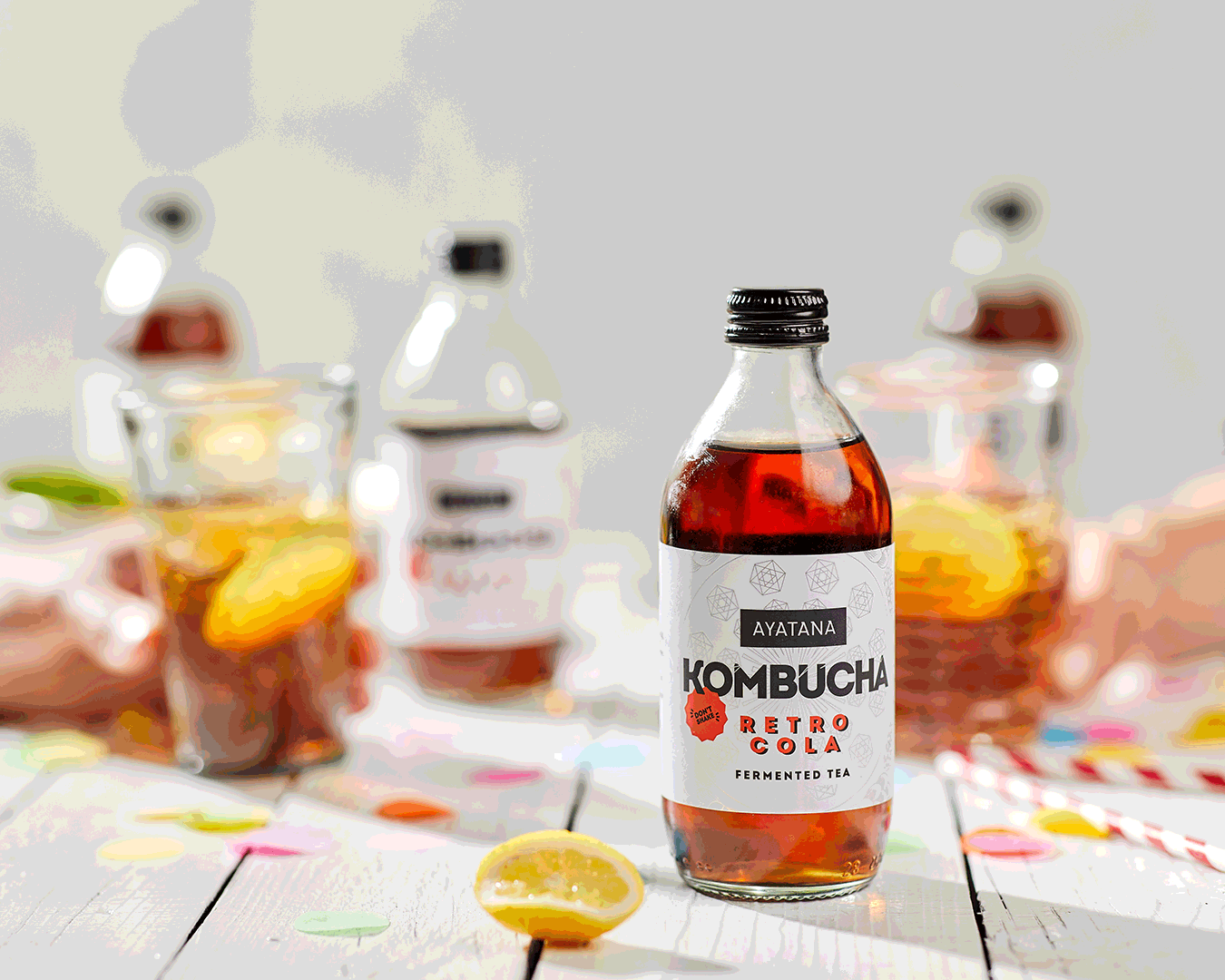
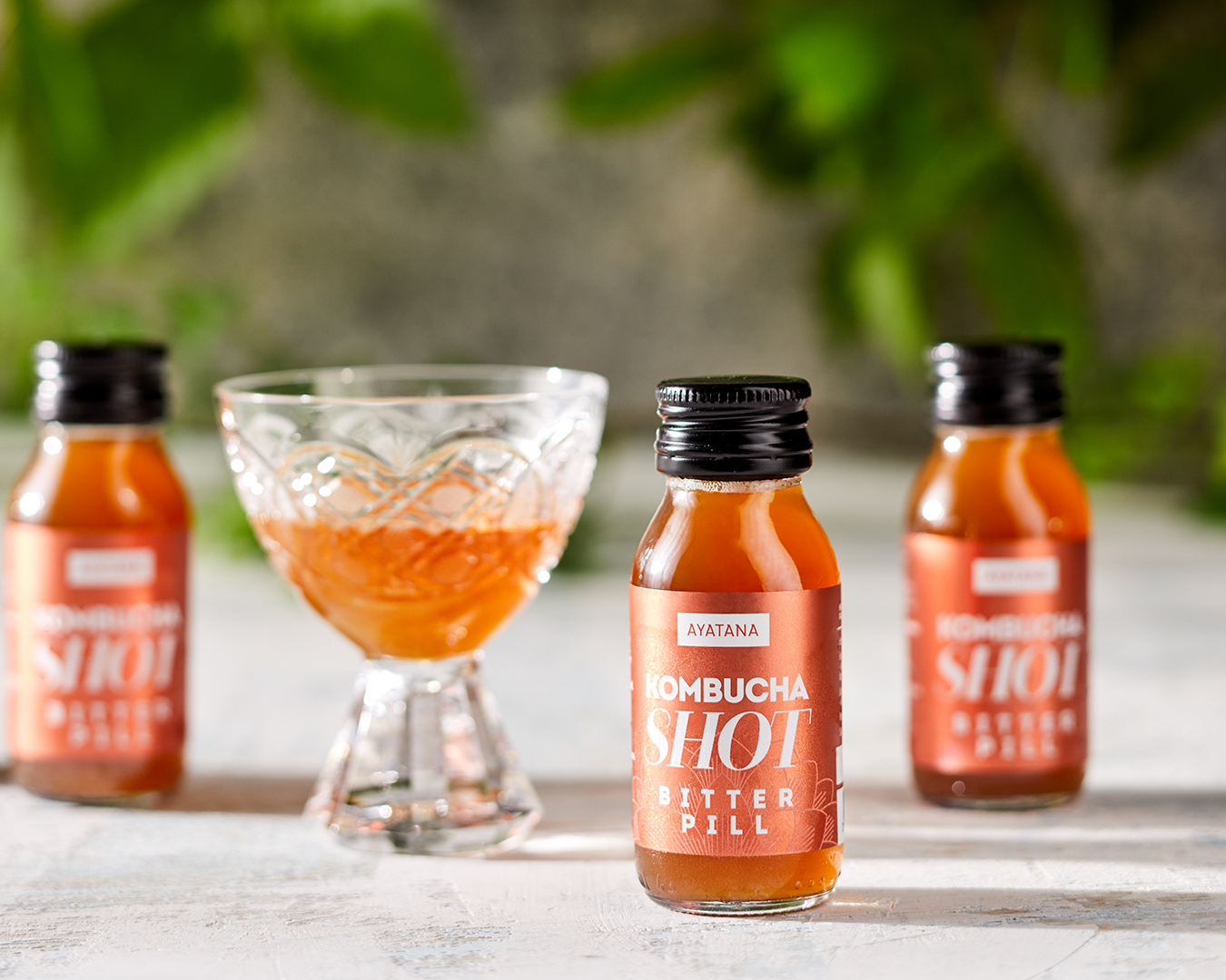
To differentiate the products, the water kefirs feature softer and lighter colors, while kombuchas are designed with richer and more contrasting tones. The special shots are dark and metallic to convey their concentrated nature.
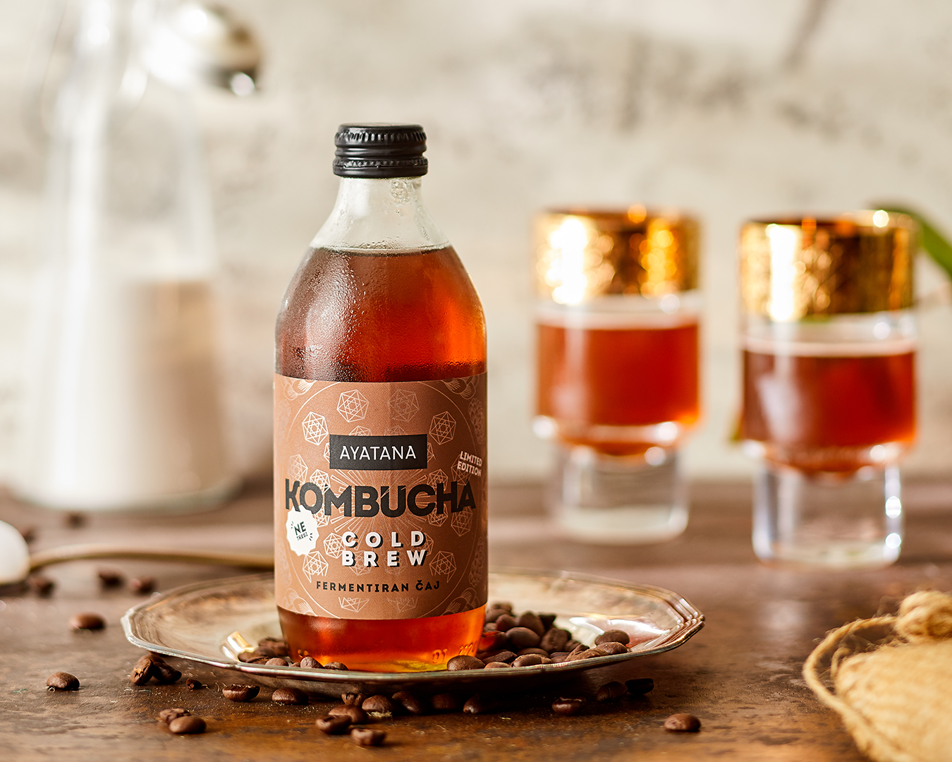
Later, cans and kombucha immune shots were added to the product lineup, continuing the same visual story.
MENTION/

“The uniqueness of this project is using aluminum foil with digital printing to create metallic elements and finishing label production with the soft-touch finish. This allowed us to be as economical as possible with the print runs, while still ensuring that the visual appearance of the entire line didn’t suffer due to the printing method.”
— Anja Korenč