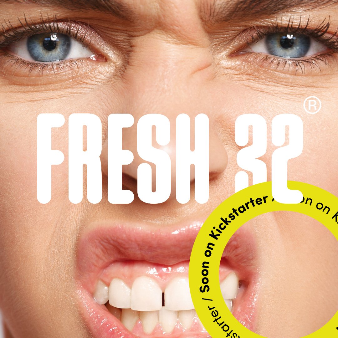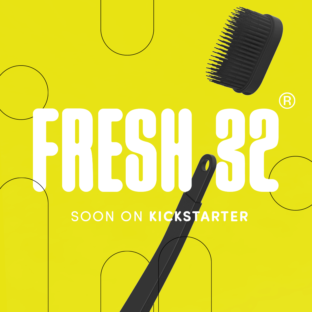
Fresh 32
CHALENGE/
Re-branding the toothpaste tablet brand known as Alternative + to target Gen Z consumers, using an edgy tone and a flexible identity that allows for future product line extensions.
SOLUTION/
The entire visual identity was designed with an edgy and colorful tone in mind.
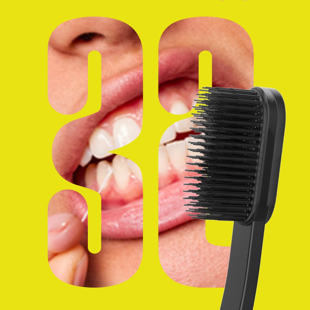
The logo mimics the motion of a tablet drawing the characters, with rounded shapes carried consistently throughout all visual communication.
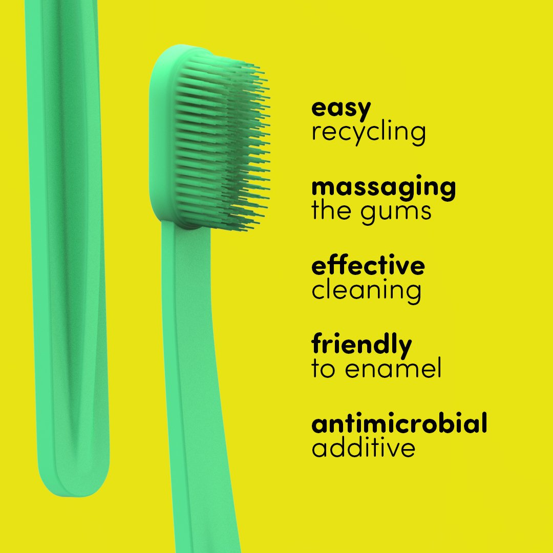
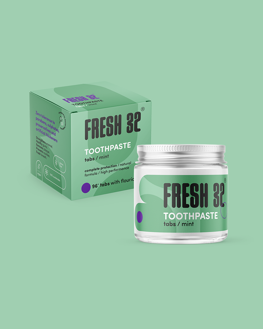
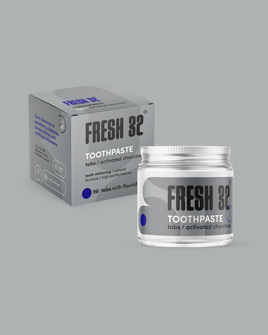
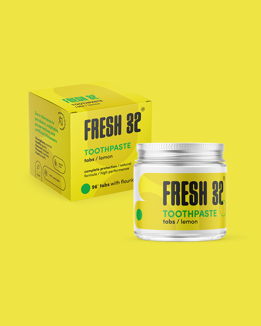
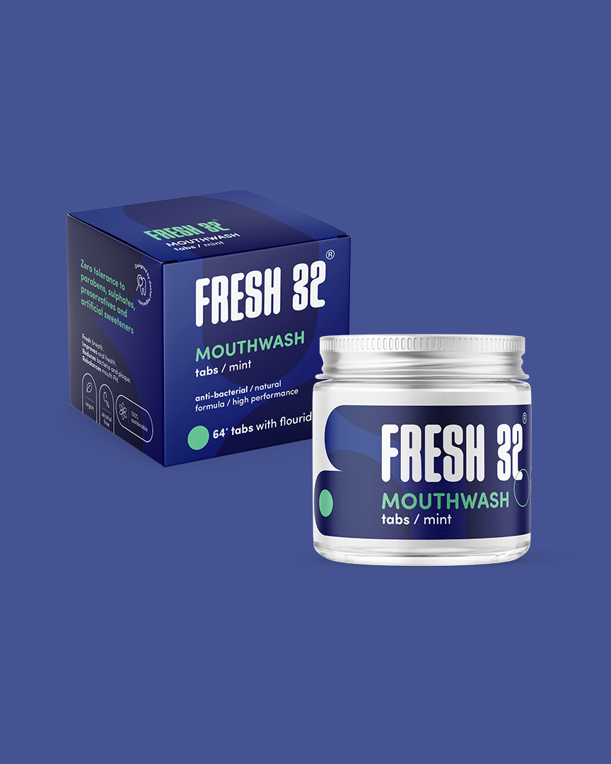
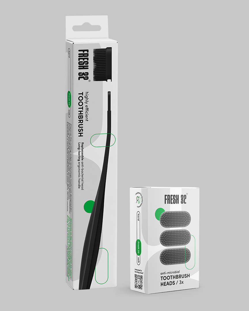
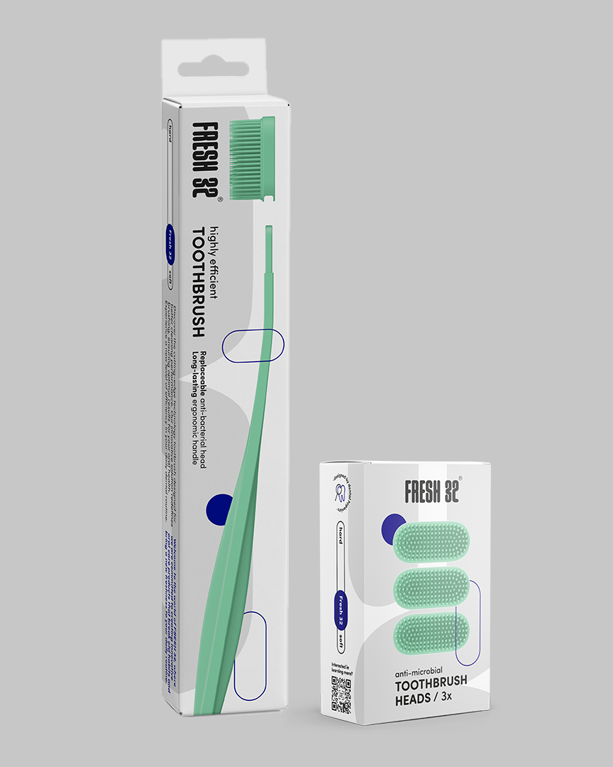
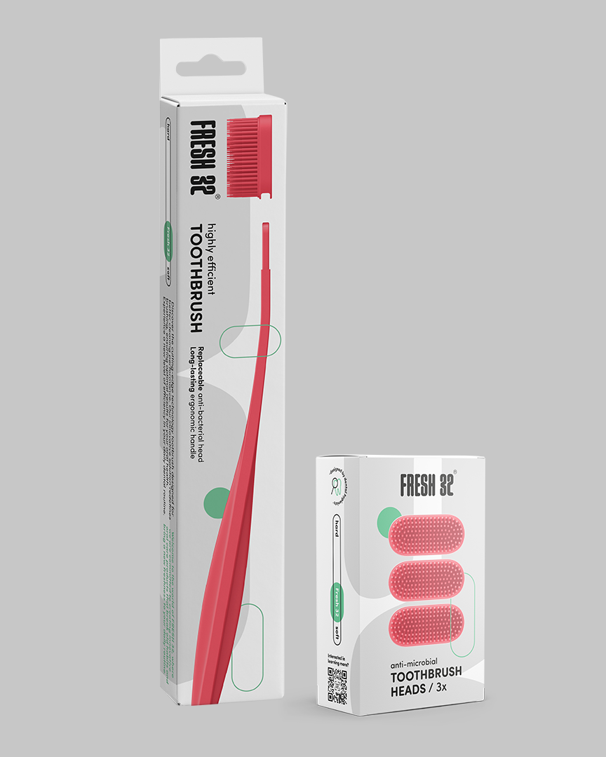
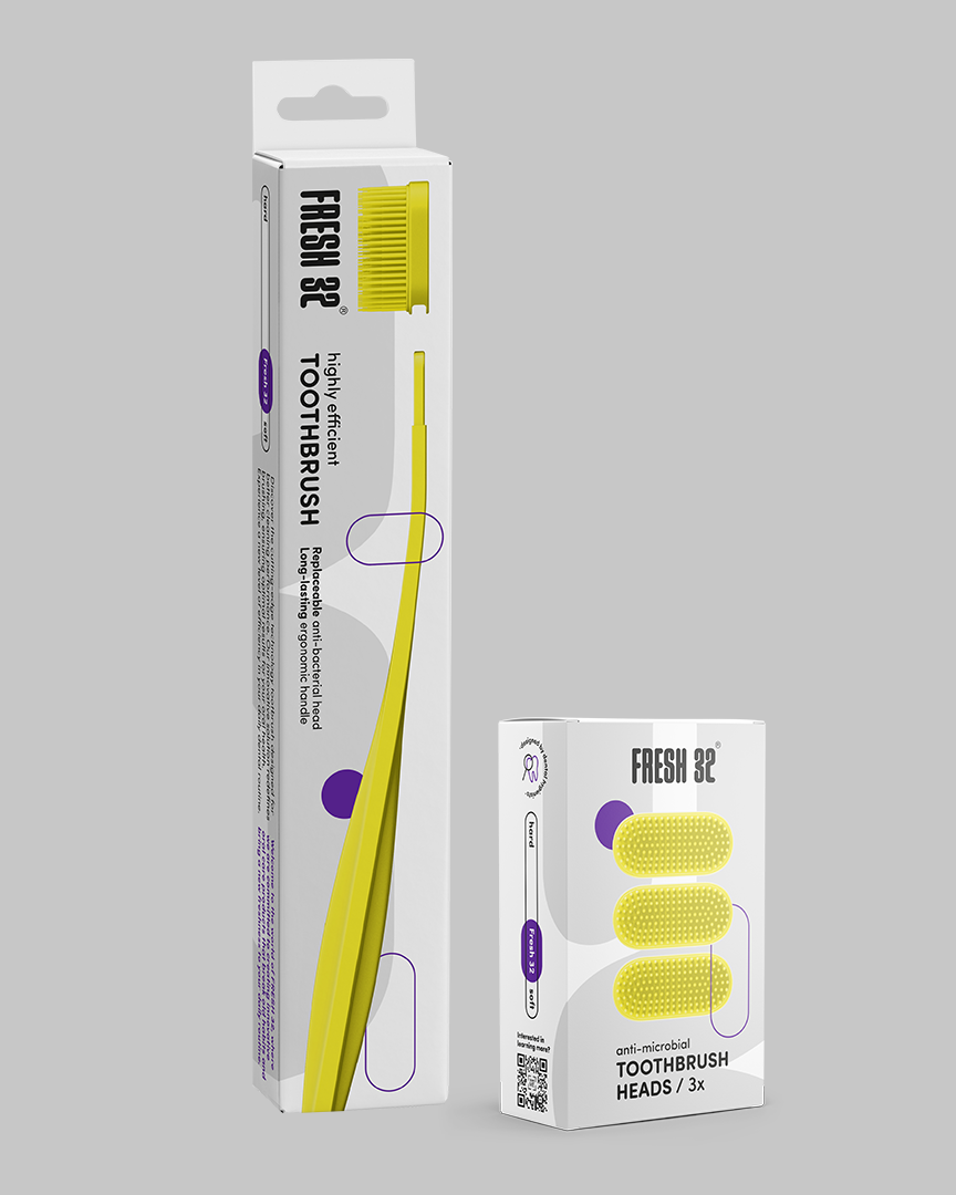
Colors represent different flavors. In the technical product line, these colors were applied directly to the products themselves, complemented by rounded edges in the product design.
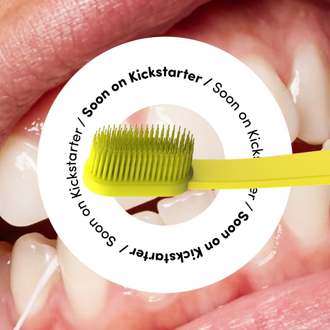
The overall art direction intentionally breaks conventional visual norms and polished standards. When preparing Meta ads for the Kickstarter campaign, the more chaotic and experimental visuals delivered the best results.
However, the packaging design is slightly more refined, following standard hierarchy principles and visual guidelines.
The name “Fresh 32” combines the idea of fresh oral hygiene with the number of teeth in a full adult set.
“The overall art direction intentionally breaks conventional visual norms and polished standards. When preparing Meta ads for the Kickstarter campaign, the more chaotic and experimental visuals delivered the best results.”
— Anja Korenč