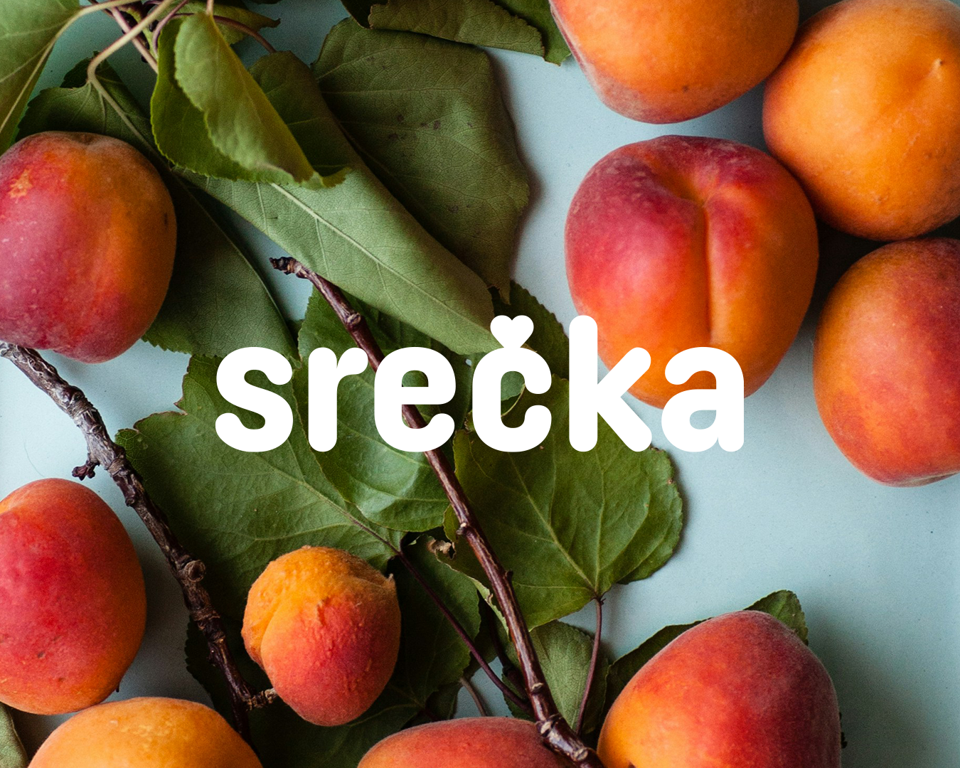
Srečka
GOAL/
Developing a visual identity for one of well known Slovenian food content creators, Ines Pusovnik, to enhance her personal brand.
SOLUTION/
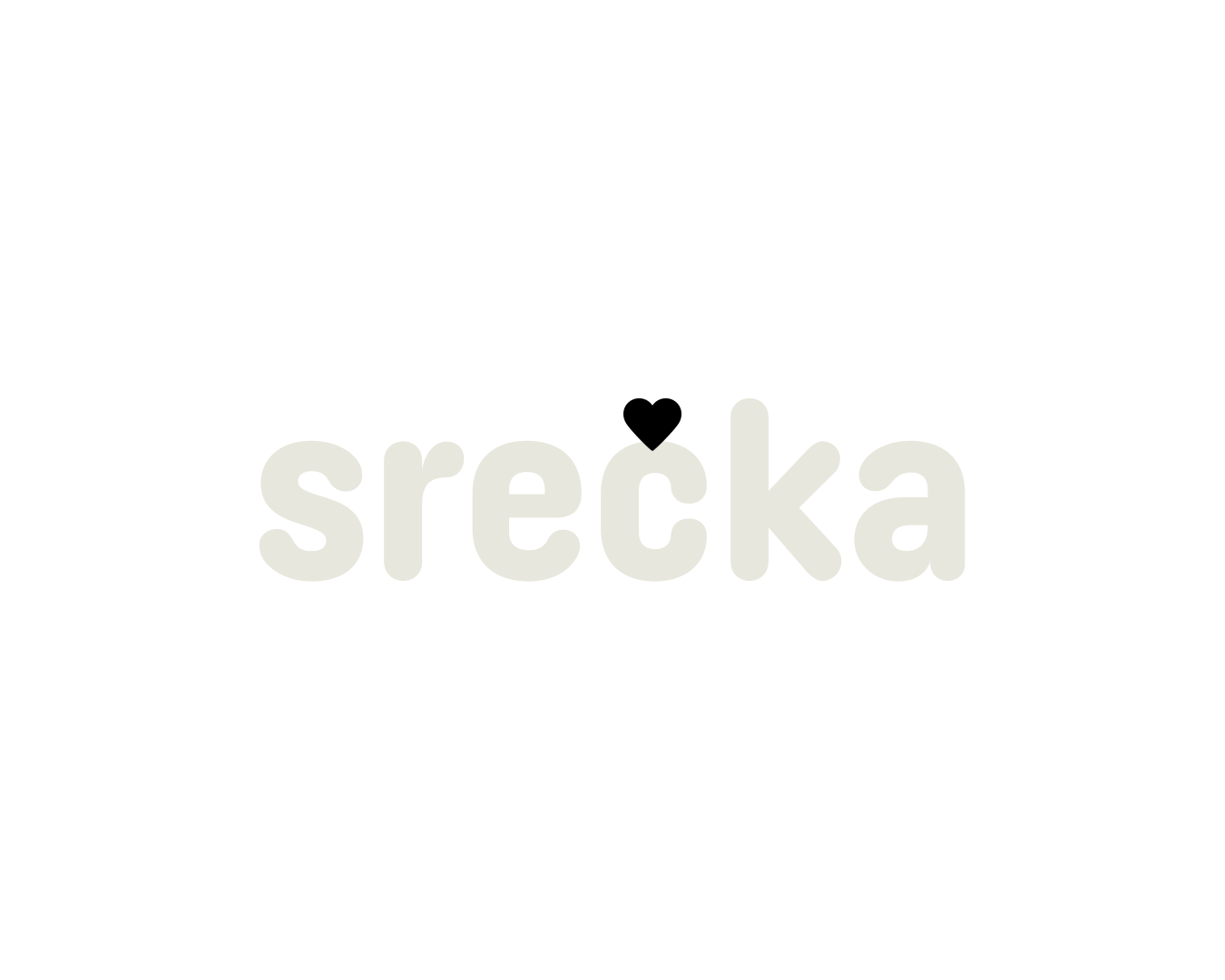
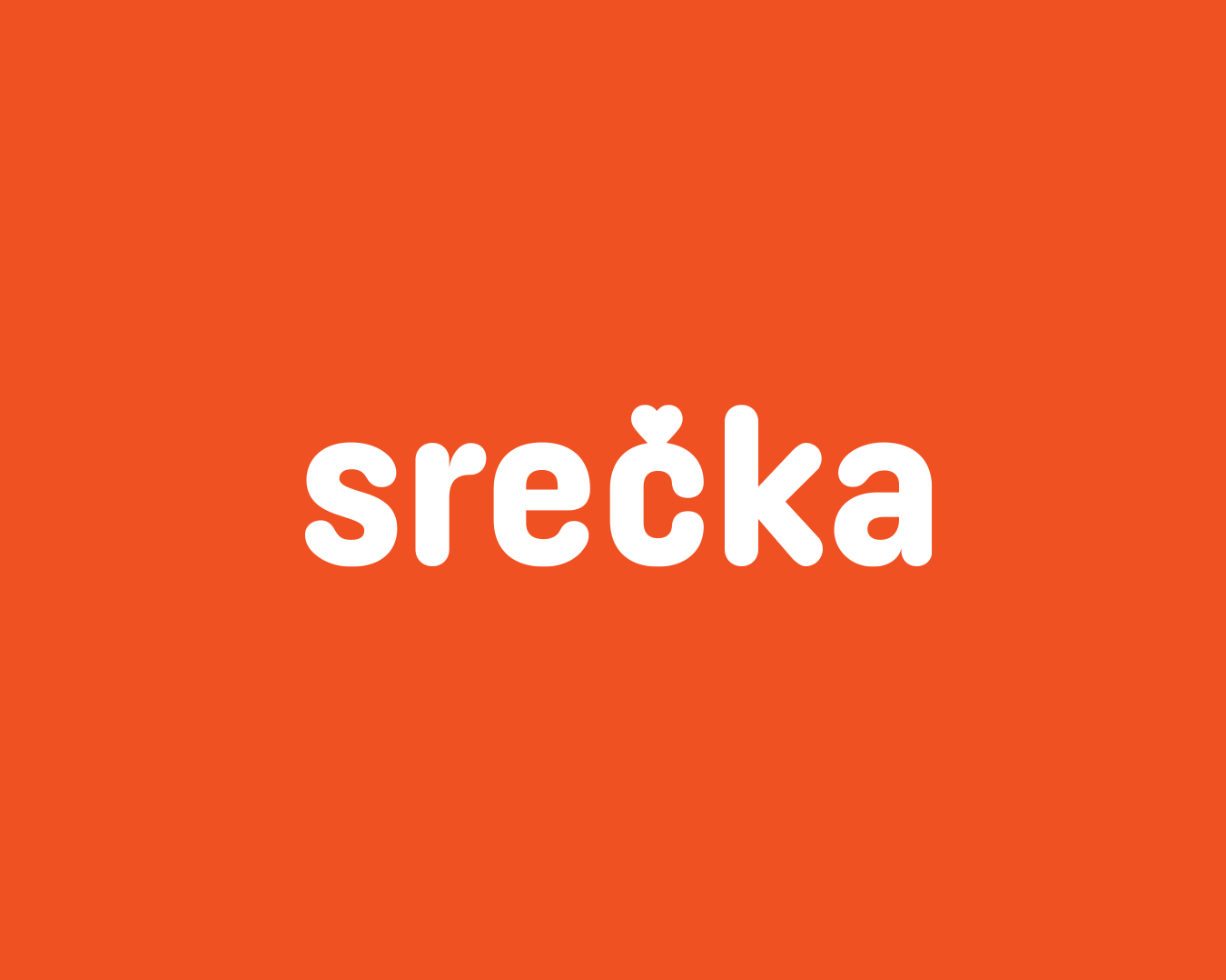
In Slovenian, “Srečka” means someone who is happy. The focus of the content Ines shares with her followers is teaching them how to be happy. Through the food they consume and by taking time for themselves.
Her goal is to create a community and a space where women feel understood, accepted, and gain the knowledge they need.
The main goal was to incorporate a happy element into the visual identity while keeping it fun and playful.
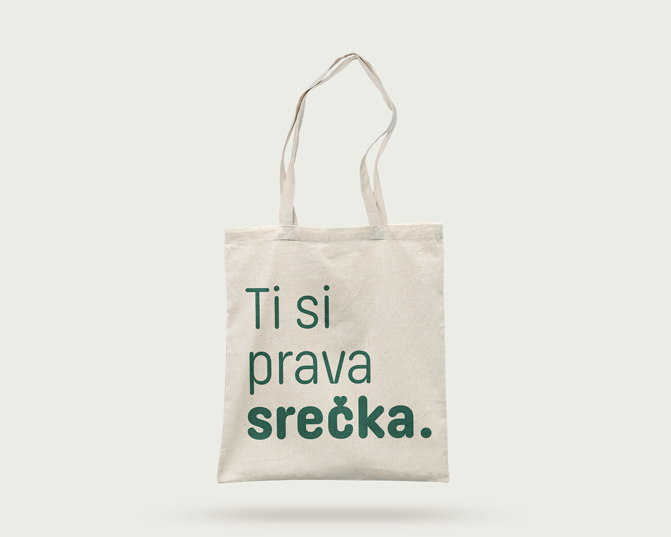
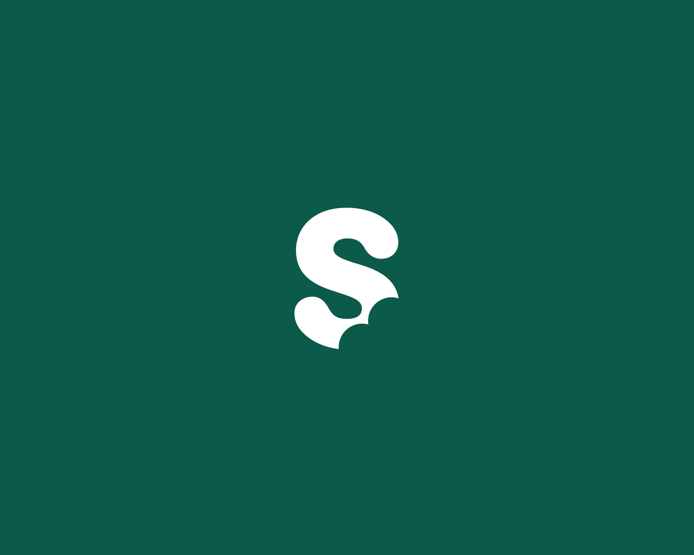
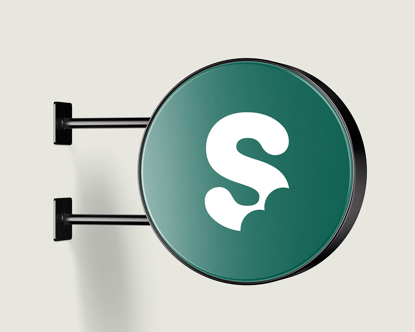
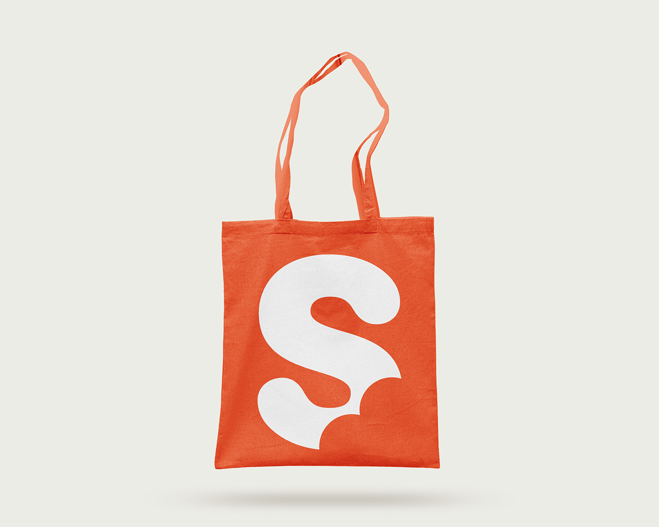
I achieved this by replacing the usual caron (ˇ) over the letter “S”, which is common in Slovenian alphabet, with a heart shape. The heart thus becomes an element that can appear as a signature in various other positions.
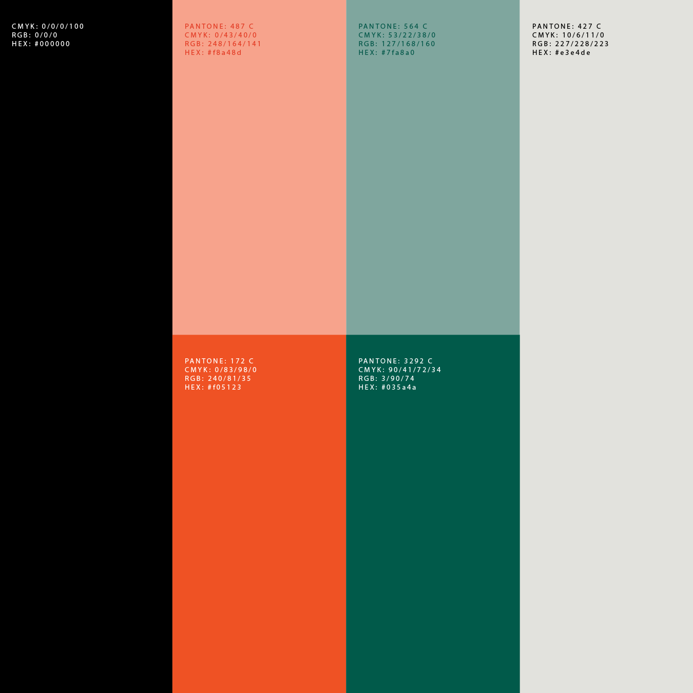
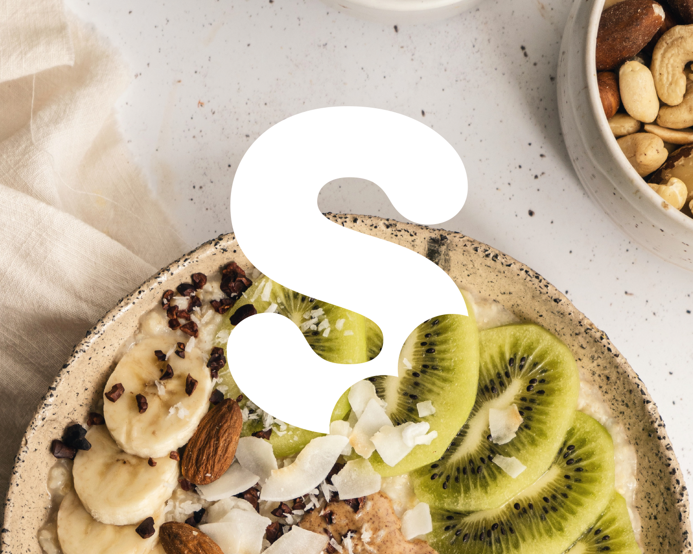
The typography is rounded, symbolizing relaxation, playfulness, and softness. This is also communicated through the primary colors, which are a combination of pastel and vibrant tones. The evocative logo represents the letter “S,” which appears as though it has been bitten into or resembles a cheeky little bottom :) Its shape is derived from the heart.
The entire system had to be developed with the potential expansion of the brand into a physical location or tangible products in mind.