Klas
Restaurant
MY ROLE/
LEAD ART DIRECTION
CREATIVE DIRECTION
VISUAL IDENTITY DESIGN
BRANDING
ILLUSTRATION
CLIENT/
KLAS RESTAURANT
AGENCY/
BOLD GROUP
YEAR/
2024
GOAL/
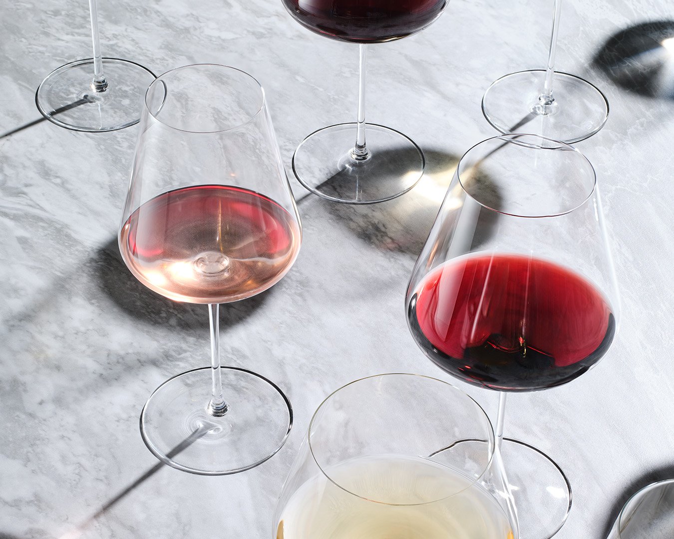
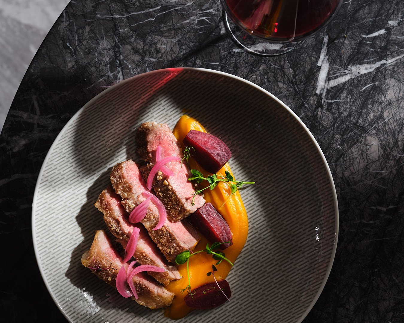
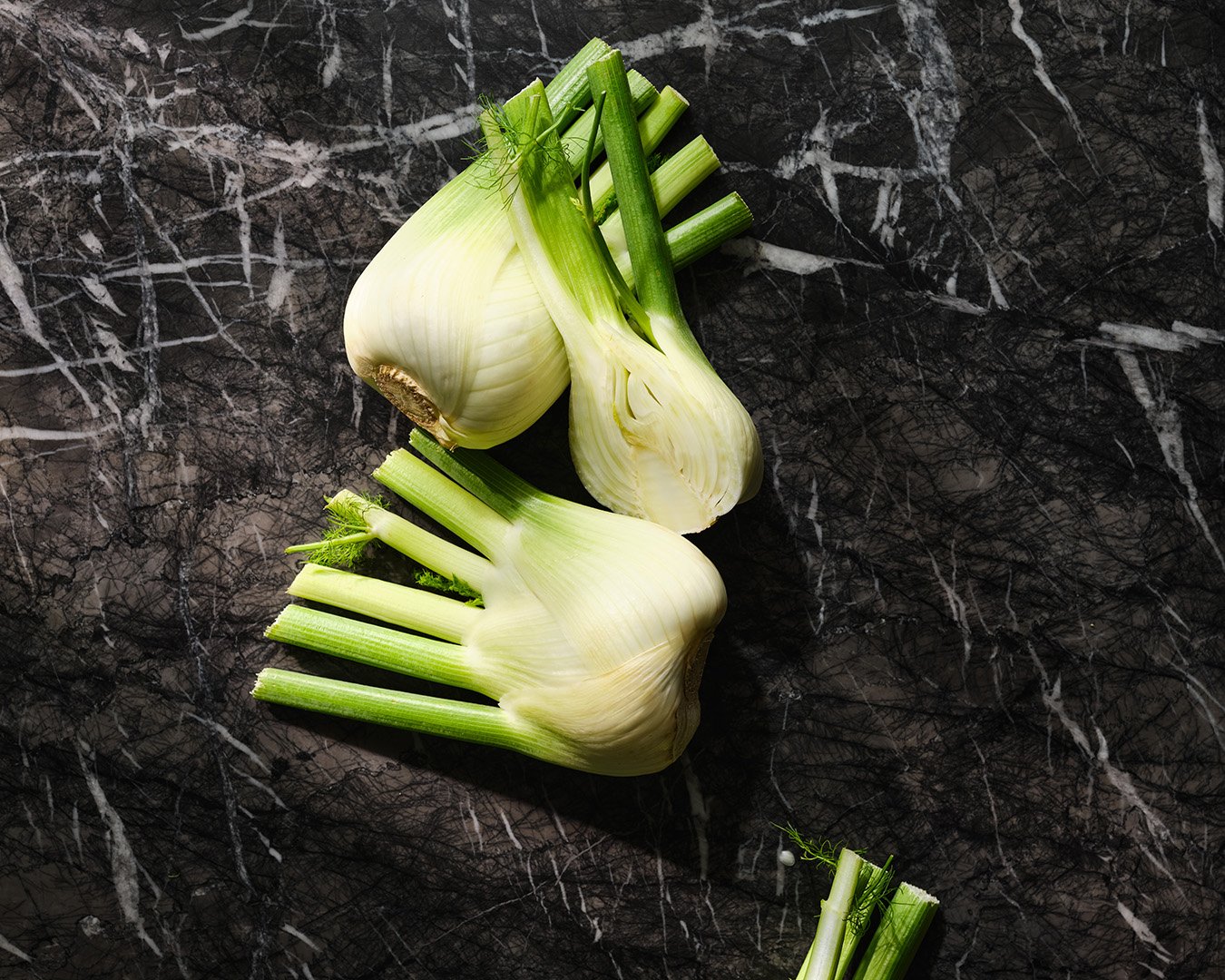
Develop branding for a high-end restaurant focused on premium ingredients and the chef’s personal touch.
SOLUTION/
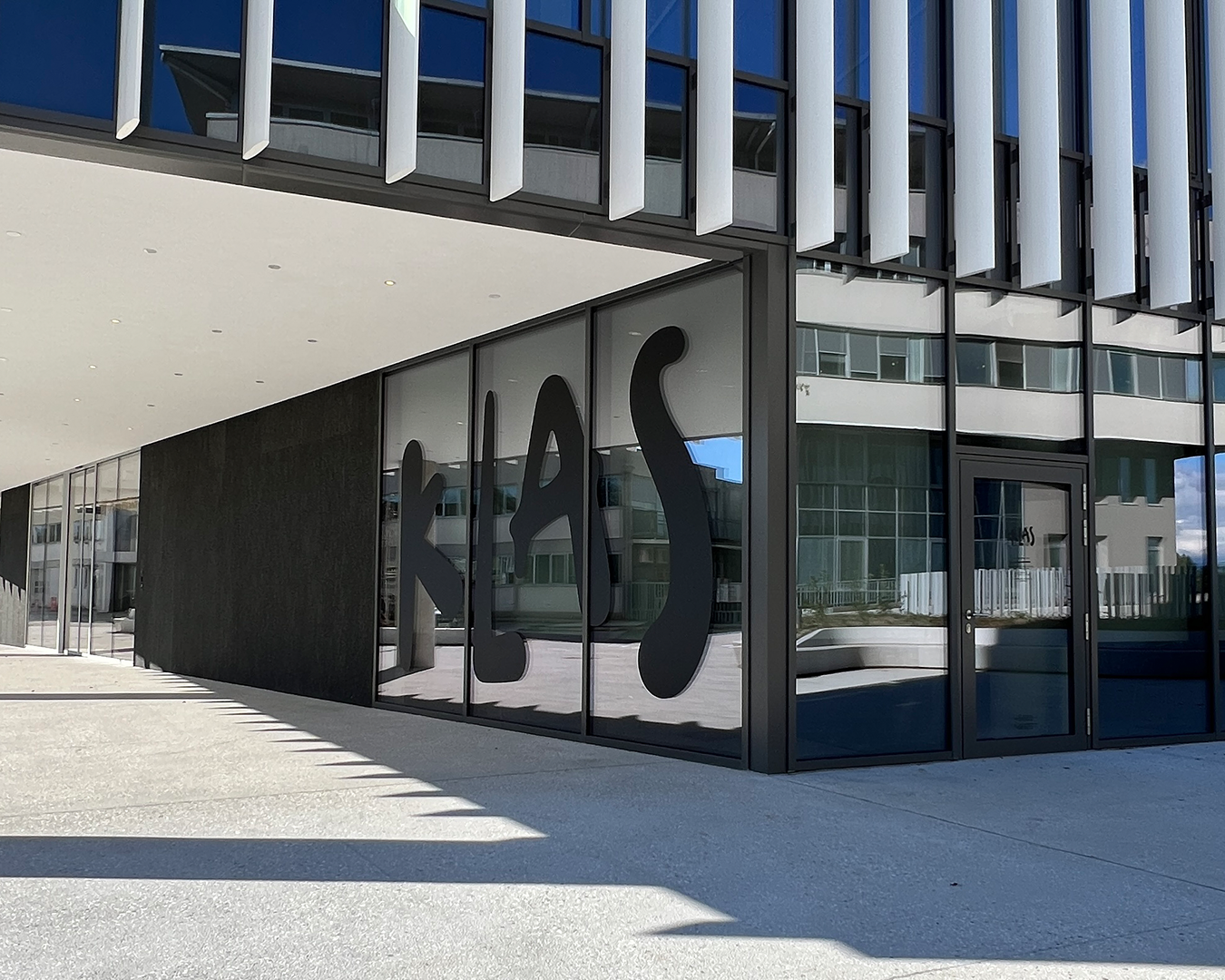
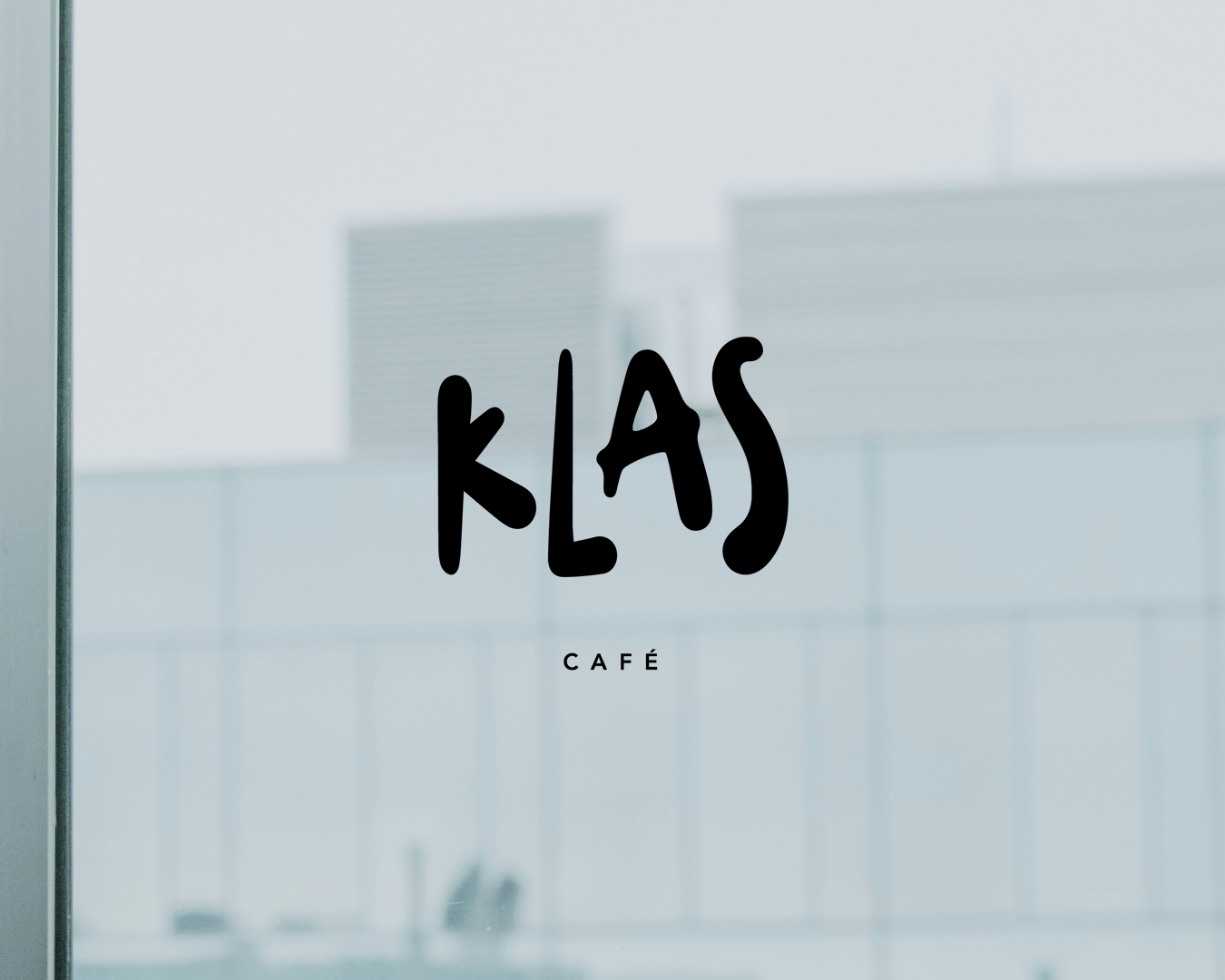
The name Klas is an anagram of the chef’s surname. At the same time, klas means “ear of grain” in Slovenian, symbolizing authenticity and connection. This dual meaning serves as the foundation for the entire creative and art direction of the brand.
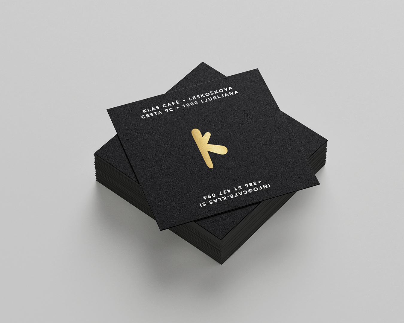
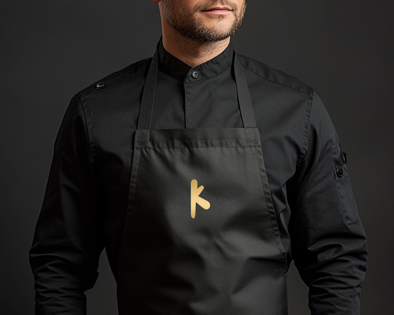
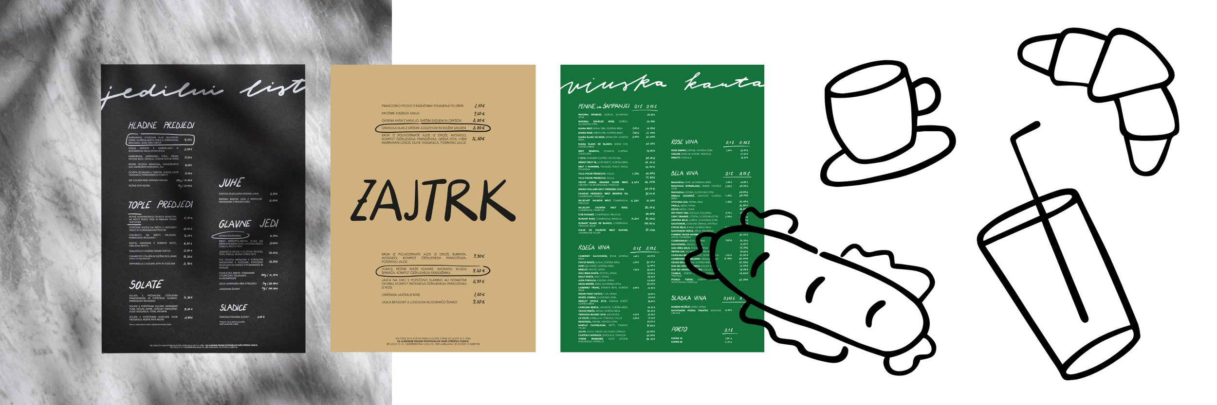
The visual identity centers around a handcrafted logo. This unique handwritten style extends across other print materials and visual elements that guests interact with regularly.
The primary colors, black, forest green, sand, and gold, tie together the narrative of a premium offering.
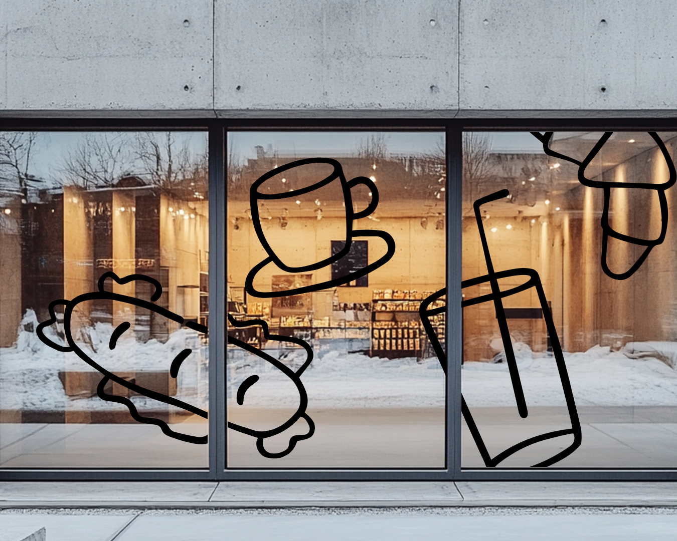
Handwritten typography is unique and developed by me. As well as all the doodles which were created for the branding of the café located next to the restaurant, intended for the purchase of simpler meals that can be enjoyed on the go.
The print materials are produced on thick, textured paper to evoke a sense of authenticity and rawness.
Each menu is sized at A3, providing guests with a distinctive and memorable experience.
“The name Klas is an anagram of the chef’s surname. At the same time, klas means “ear of grain” in Slovenian, symbolizing authenticity and connection. This dual meaning serves as the foundation for the entire creative and art direction of the brand.”
— Anja Korenč